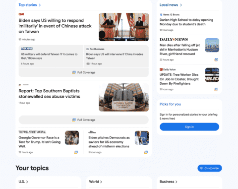
Google is testing a new trail version of the Google News portal at news.google.com. It is a limited trail, I was only able to bring it up once in Safari private mode, but then I lost it. The new home page is more visual, brings the navigation menu from the left side to the top and overall cleans up the look of the home page.
What it looks like. Here is a screenshot of the top of the page that I was able to screen capture when I saw the test – you can click on it to enlarge it:
Here is the bottom portion of the page where you can see the “Fact check” section. Again, you can click on it to enlarge it:
When will you see it. Again, this is just a test, just a trial, Google is running to see if those in this test group like the new Google News design and if the responses they expect from the new design is positive or negative. Google is constantly testing new user interfaces across all their platforms, so this should come as no surprise.
Why we care. Whenever Google releases a new design or user interface in Google Search or Google News, that can impact ones visibility and clicks to their web site. So keep these user interface tests in mind when understanding any risks or rewards you might see in the future with Google News interface changes.
Again, this is just a test – it is hard to know if and when this new design will go live.
The post Google News new design being tested appeared first on Search Engine Land.
Source: Search Engine Land
Link: Google News new design being tested


